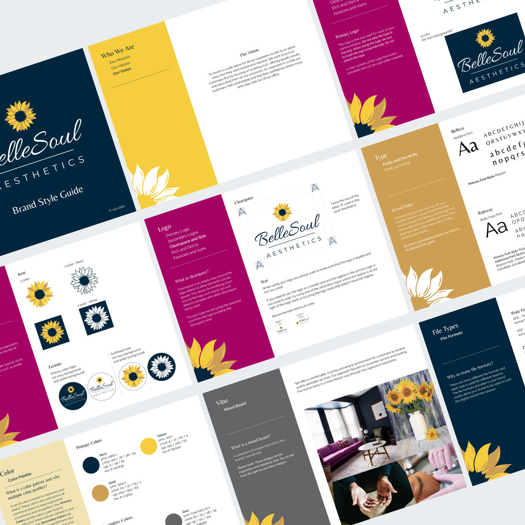
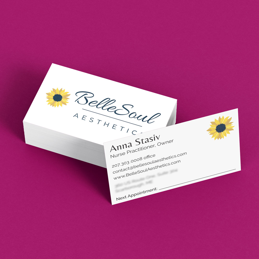
To develop a brand identity for an aesthetician company that captured not only quality care but also comfort, loyalty, trust and connection.
We chose to use a sunflower as the main graphic element for the logo because it captured the essence of beauty but also symbolizes loyalty. The flowy interconnecting petals provide a sense of comfort and connection. We then chose to compliment the beauty of the sunflower with a script font for the first part of the company name. Then a non script sans serif font was selected for the “Aesthetics” text to convey a sense of knowledge and trust.
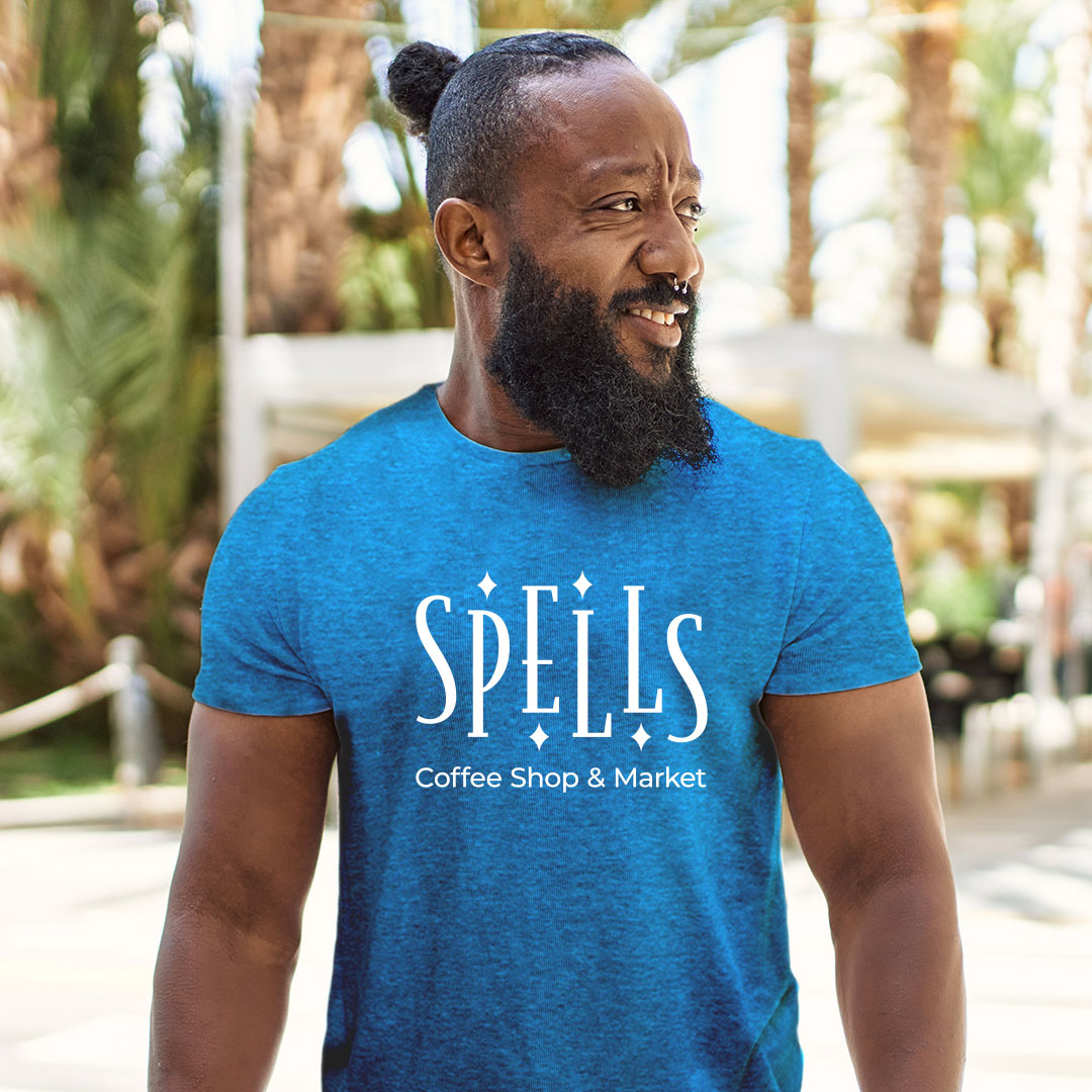
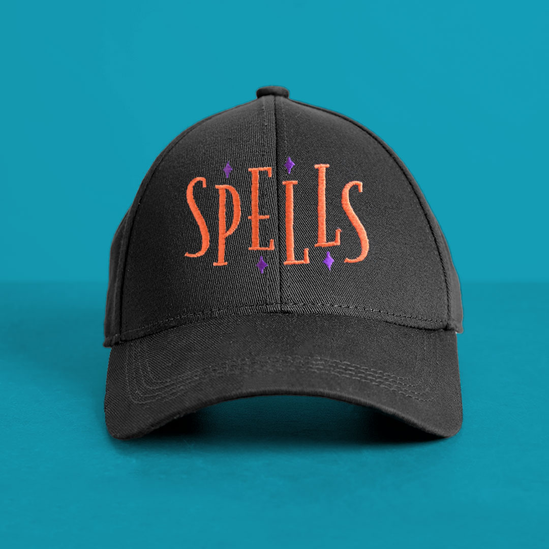
To develop a brand identity that embodied a whimsical, artistic feel while also conveying consistency and quality.
For this logo we wanted to delicately balance the whimsical feel with strength and stability. As a result we use chose to use a tall serif typeface that provided stability, conveying consistency and quality. By staggering the letters evenly and adding diamonds within some of the negative space, not only we were able to capture the whimsical artistic feel but it also offers a sense movement tapping in to the on- the-go customers they serve. The logo was then placed on t-shirts and hats for their staff and for sale.
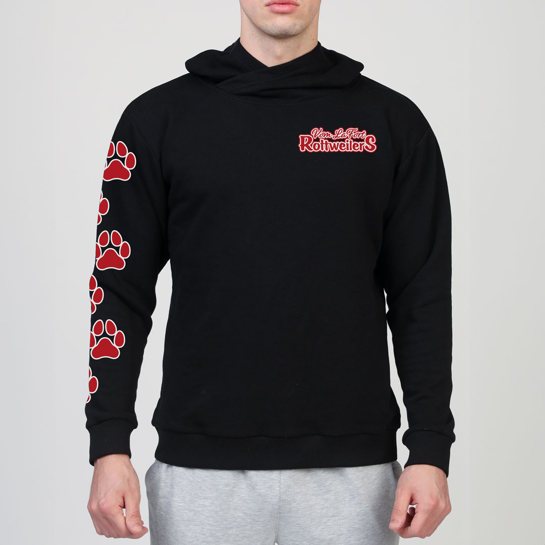
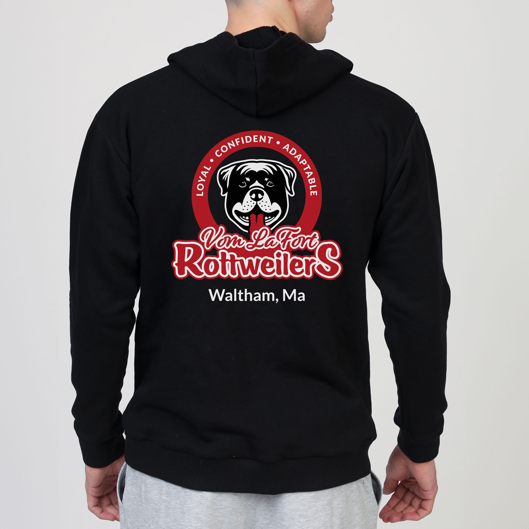
To define the visual story of Vom LaFort Rottweilers. Vom LaFort Rottweilers is dog breeding company that specializes in breeding Rottweilers and educating potential customers about the breed providing a more accurate and positive view of how wonderful, friendly, loyal and adaptable Rottweilers actually are.
To help change the narrative around the Rottweiler breed, we used circular logo with a friendly looking Rottweiler head illustration that is reminiscent of the old school cartoon opening sequence. To compliment the illustration, a brush script and hand written fonts were chosen to write out the company name. The logo was then adapted for apparel by creating a simplified text version of the logo for a left chest and paw prints to add going up the sleeve.
